Global Product Rebrand
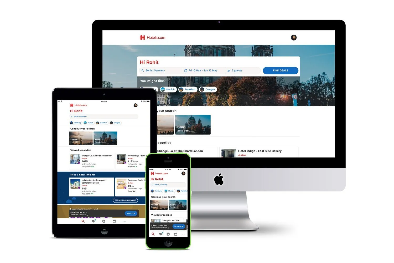
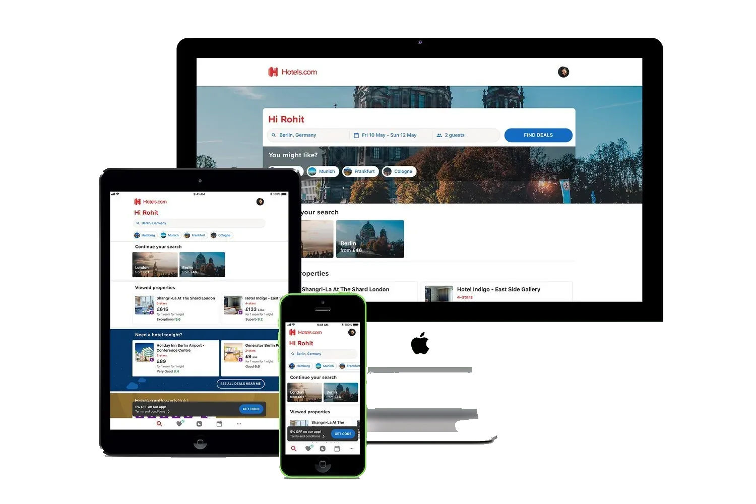
The Hotels.com brand, carried through the mobile products.
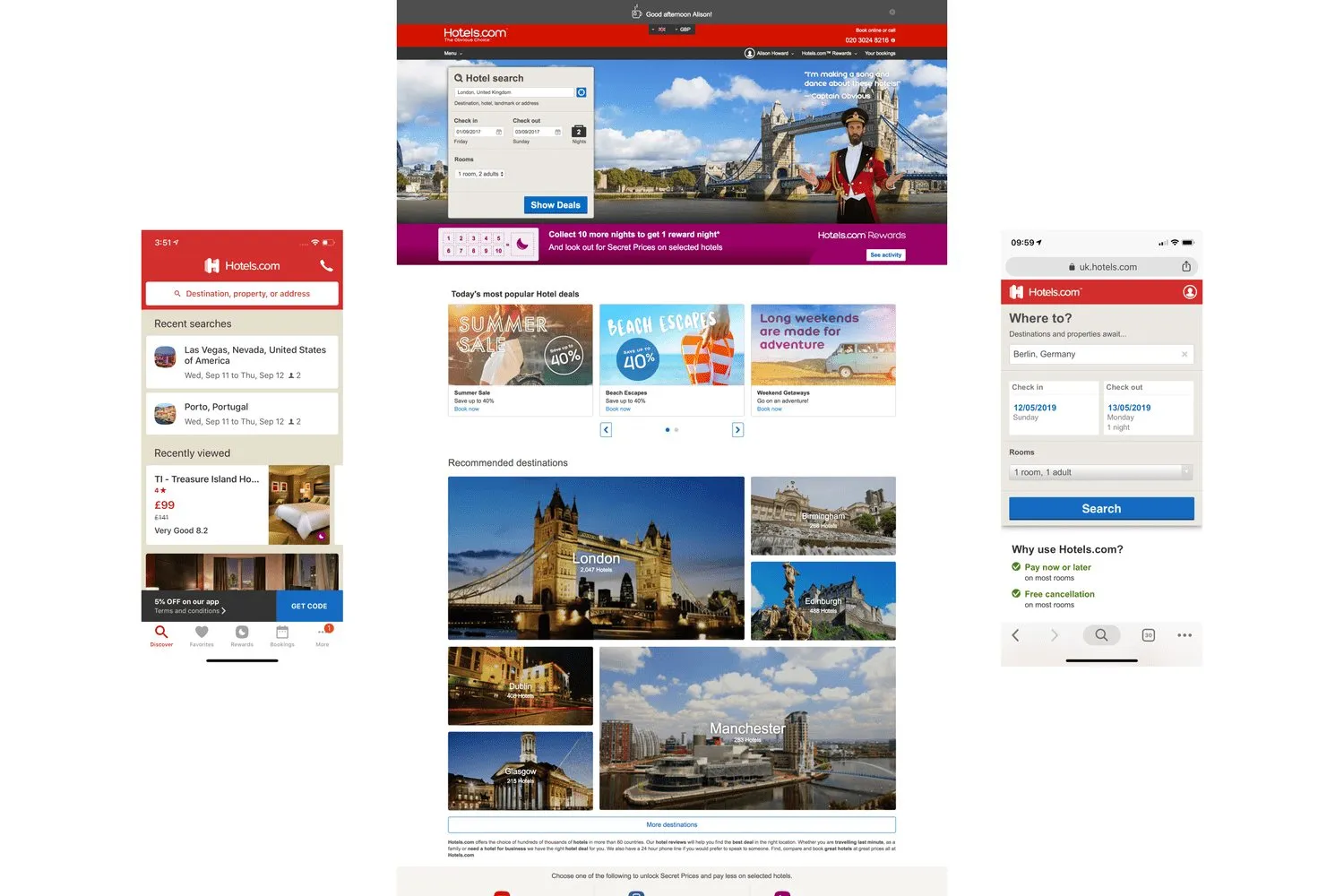
The products did not match
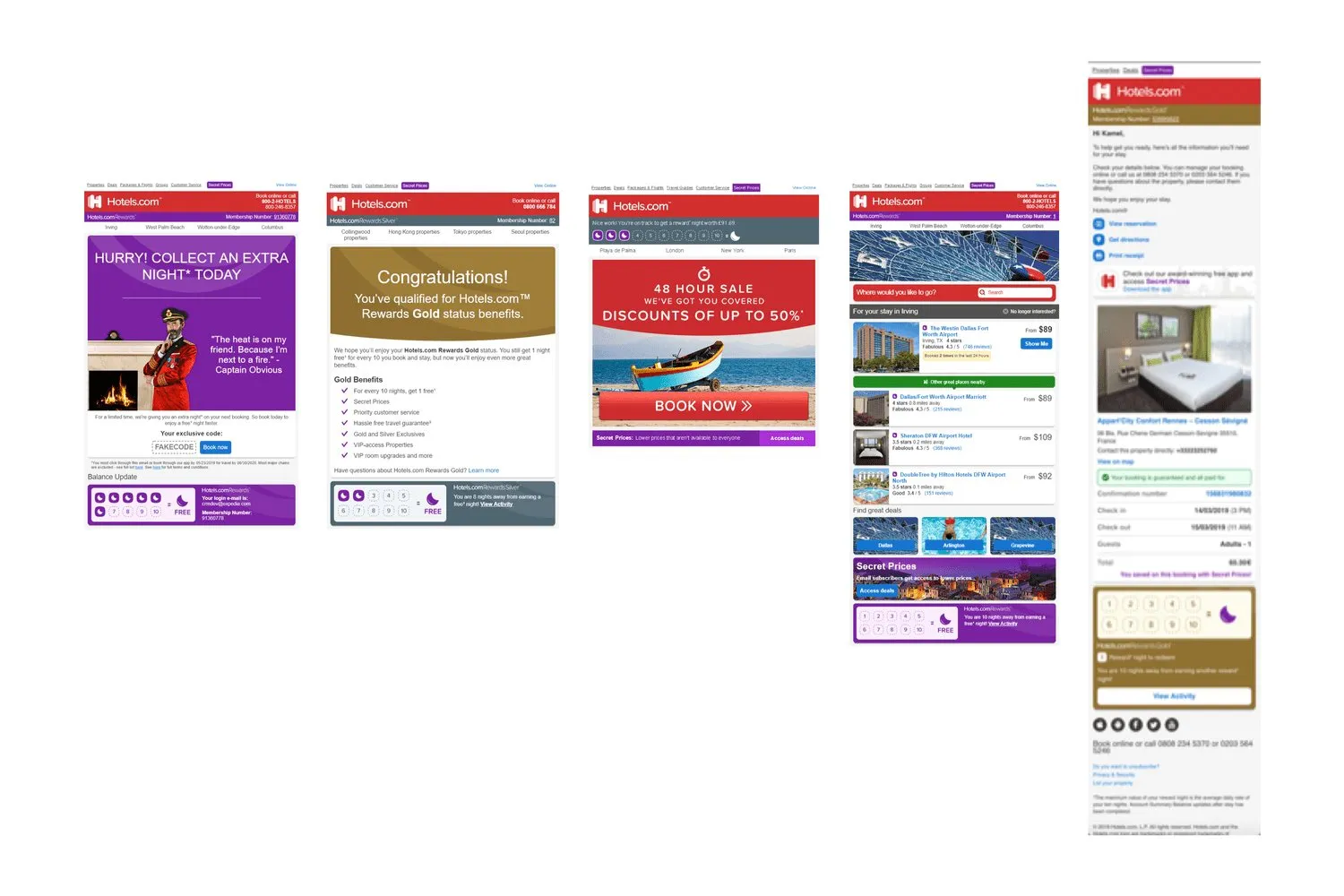
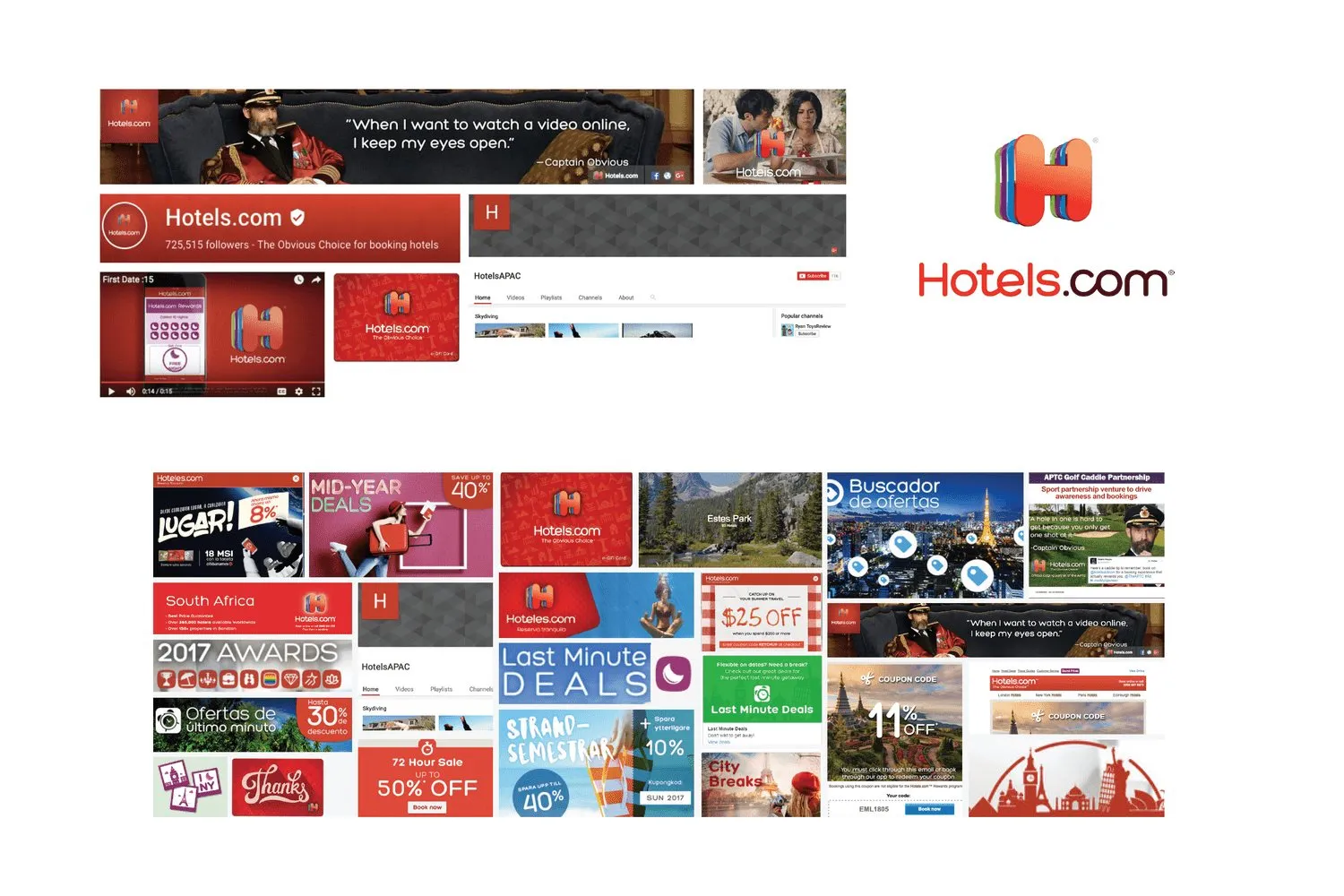
I led the refresh from the product side. The growth was with a newer kind of traveller, and the brand had to hold together on the phone, the site, email, and merchandising. It did not. Each surface had its own version.
The mark and the icon
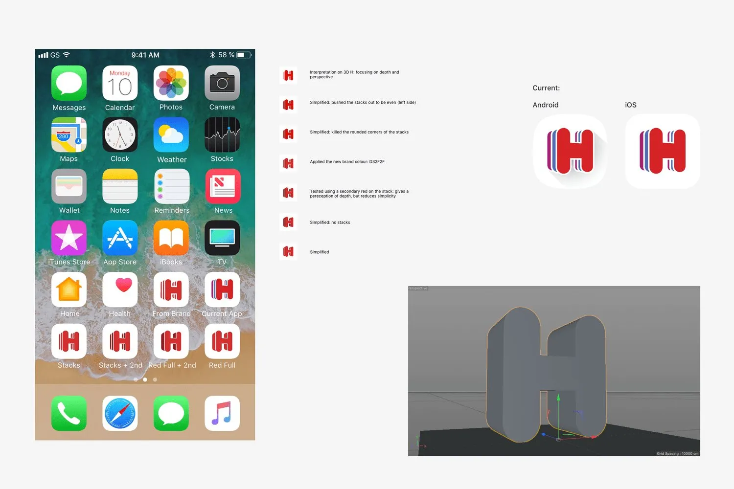
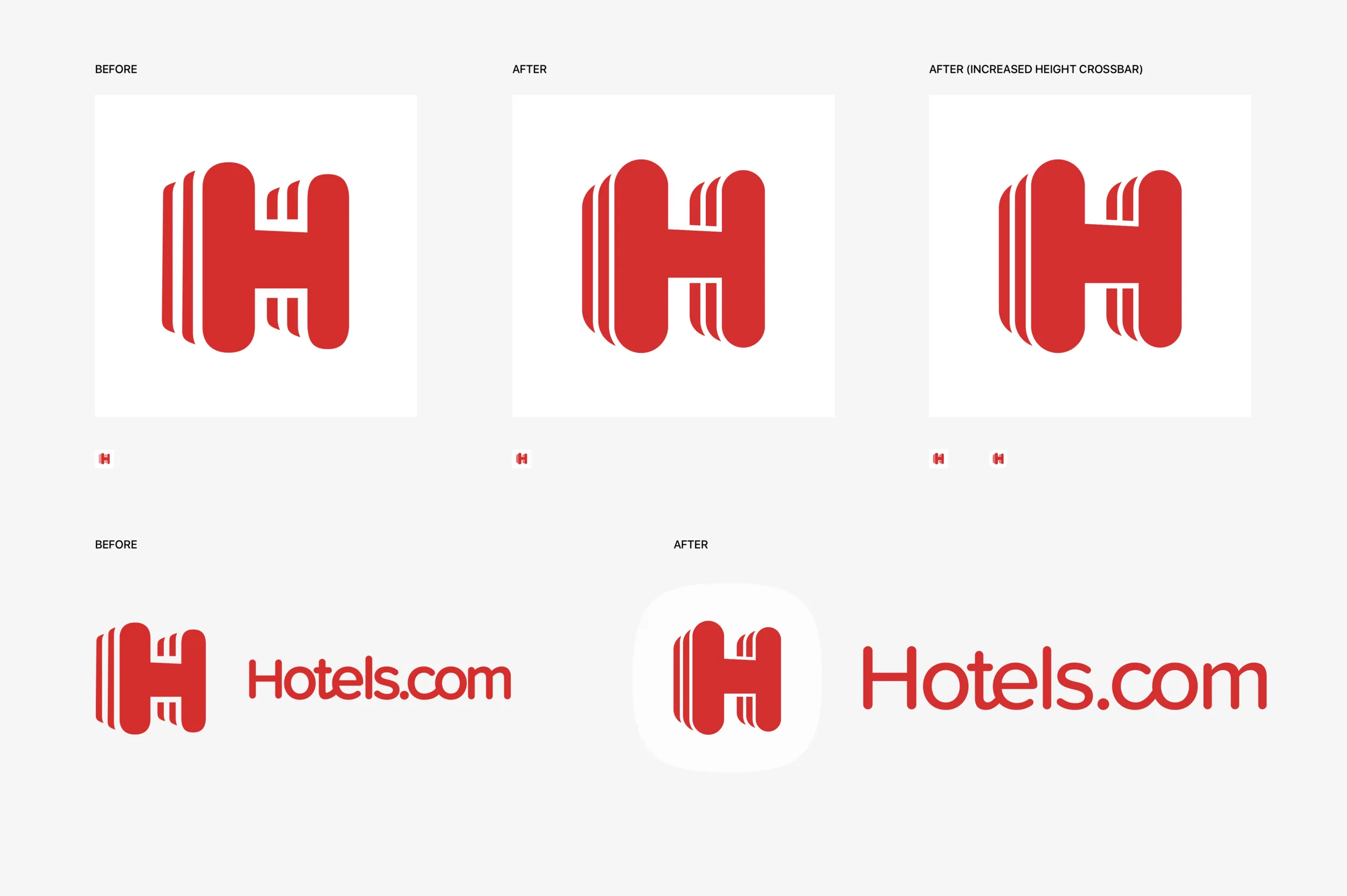
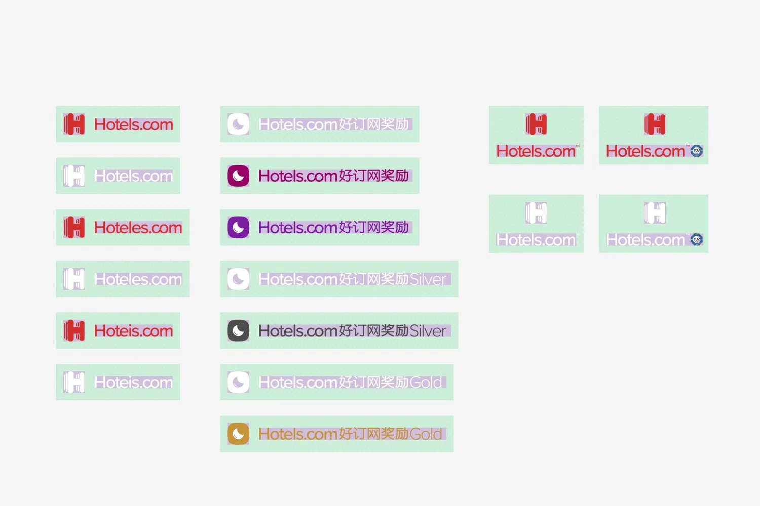
The logo stayed recognisable. The wordmark and the stacked H had to sit in one system, in the brand type and the brand colours. We started with the app icon, then Rewards, then the other markets.
The H was cleaned up, and the wordmark moved to sit with the mark, including inside the icon shape.
Colour, type, and photography
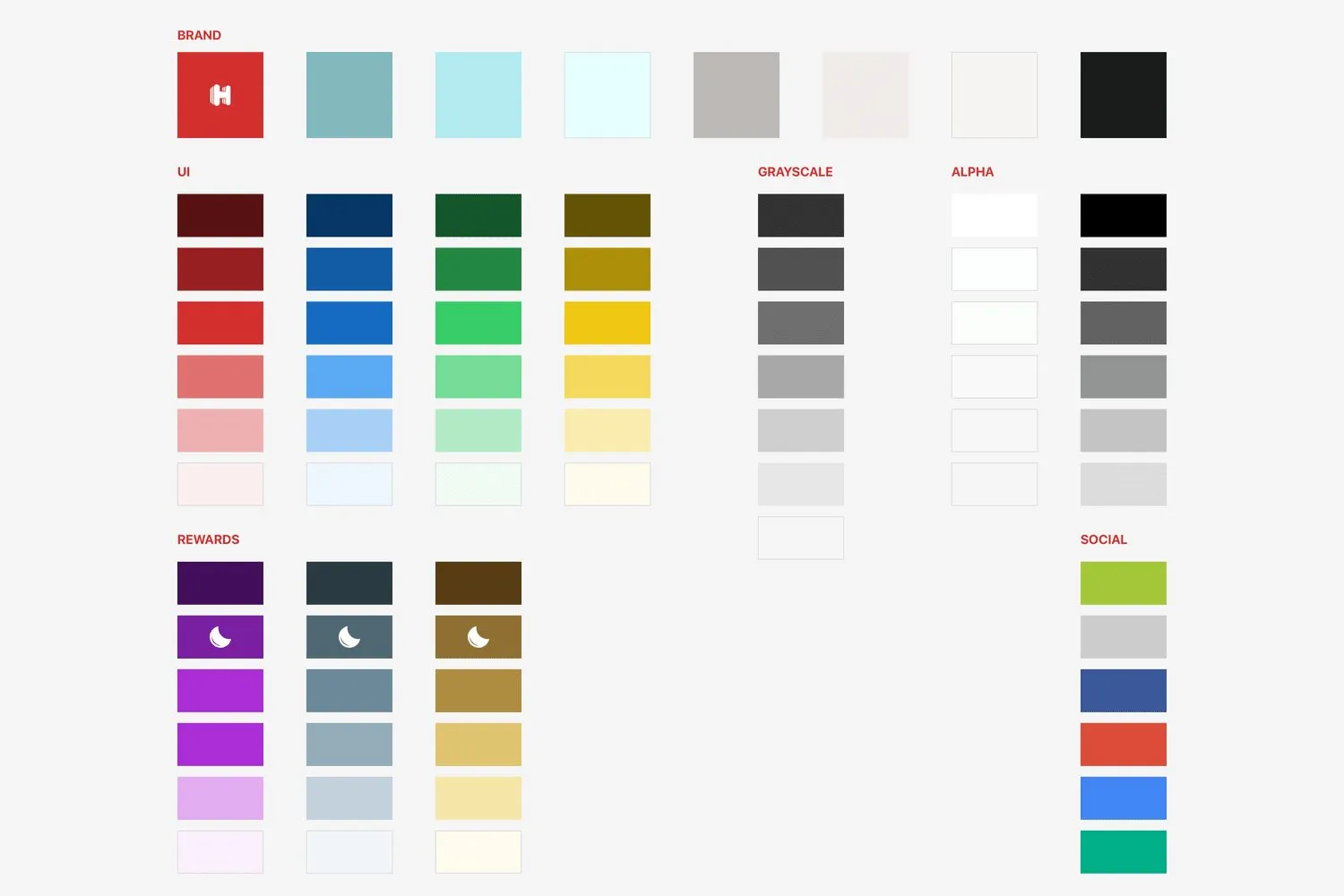
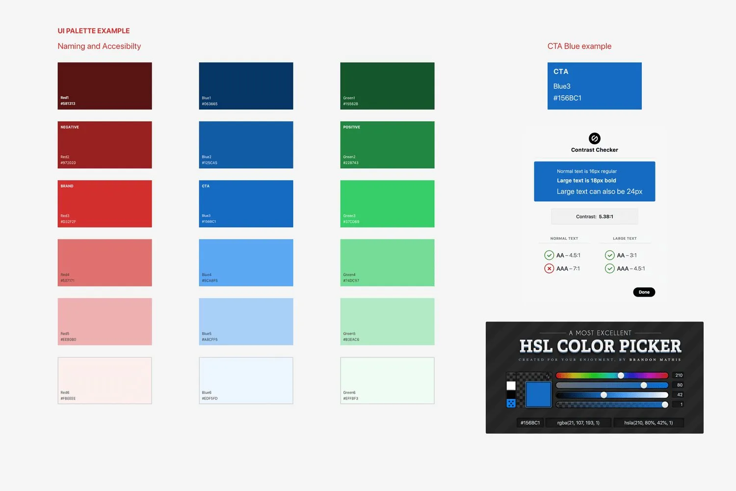
Colour had to pass WCAG AA. The interface colours stayed, and were adapted, including a dark mode for Android Q and iOS 13. They were checked on the phone and on the desktop.
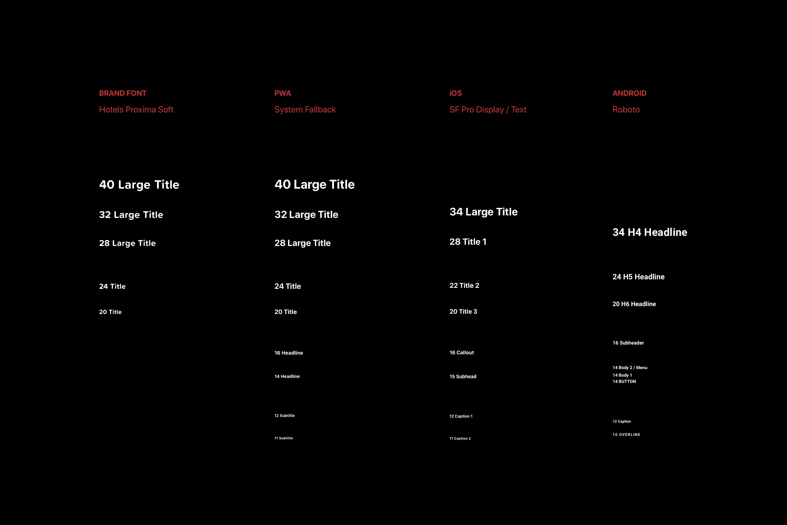
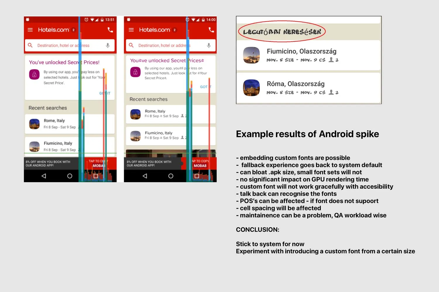
Type was the open question: a face of our own, or the system font. The trials ran on iOS, Android, and the web. The sheet sets Hotels Proxima Soft beside the system faces.
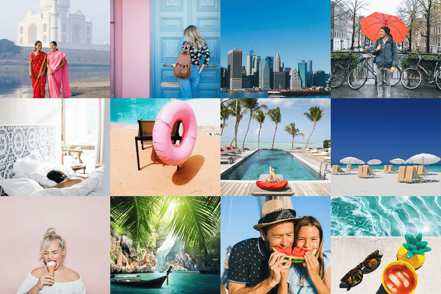
Photography was of destinations, with people in it. Hotel photography was not ours to change.
The sheets are the palette, a contrast check on a blue button, and an Android type trial. The trial’s own note says to stick with the system font for now, and to try a custom face only from a certain size.

Next