Product design
The app that could not be tested
On iOS, 2.5 extra bookings for every 100, and an estimated $3.6 million a year.
Expedia Group’s components had drifted across iOS, Android and web. We rebuilt them against a single written specification, the one source that designers, engineers and language models could all build from, instead of each interpreting a different one.
Three platforms had built the same components independently for years, we did not know how far apart they had drifted until we asked a machine to read all three.
A component was really four separate components, one in the iOS repo, one in Android, one in web, and a Figma library that matched none of them exactly, each with its own props, arrangement rules and accumulated exceptions.
The fix was to stop treating any implementation as the source. A single spec would define the component, and Figma, all three platforms and a language model would build from it, which only works if that spec is structured data rather than guesswork. A person can interpret a paragraph, but a machine cannot build from one.
The scrape across the repos is what made the drift visible. Nobody had read three implementations side by side, because nobody was ever going to, with the answer spread across three repositories, including Figma, and years of separate decisions. A machine could do this, and the plan it returned was the problem statement, and a starting point for rebuilding any given component.
A machine proposed each component by reading the code. A person decided what was actually right, and wrote the decision back in a form the machine could use.
Every component started as a scrape. We read the iOS, Android and web repositories and generated a plan, which lived in GitHub for each component: recommendations, configurations, elements, decisions, open questions, TODOs.
The plan was a proposal rather than an instruction. I rebuilt each component against it, binding variables, attaching slots, correcting naming and specifying accessibility, using code only props and slots, and where the plan was wrong I overruled it and recorded why. Engineering implemented from the finished specification, with Code Connect holding Figma and code one to one.
The machine did the reading, which no person was going to do across three codebases, and the designer did the deciding. The decision only counted once it was written somewhere the machine could read back, as a spec.
The workflow itself went to testing in Q1 2026 with Expedia product designers, and with the engineers and PMs who opted in, the people who would have to live with a specification rather than write one.
I also worked with engineers on spacing that both sides could share. A layout holds sections, and a section holds blocks, with the gaps coming from tokens. I built the layouts and a Figma playground, tested them with six designers, three from product and three from the design system, made the rules clearer, and tested again before publishing.
The guidance left Figma for DSRS, so someone without a Figma seat could read it. Jared and I rewrote it in plain language, and the fields, such as when to use and when not to use, stayed consistent so a tool could follow them. The toast page had said that toasts are temporary, non-interruptive messages for information that is not urgent. The rewrite was shorter: use toasts to share quick feedback or simple actions, and keep them off urgent or important alerts. Heeran and I added our styles to the site that rendered those pages.
The alternative was not imagined. A machine proposed it from three real codebases, a person overruled it, and the reason went back into the record.
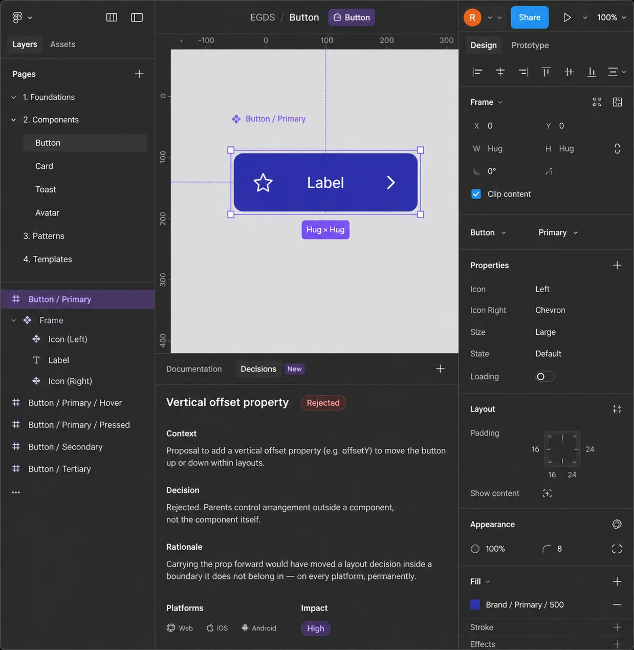
Rejected. The scrape proposed it for one reason, which was that React already had one, and that is precisely the failure mode of letting an implementation define a component, where an accident in one codebase becomes a requirement in three. Saying no cost a conversation, whereas saying yes would have cost every layout that inherited it.
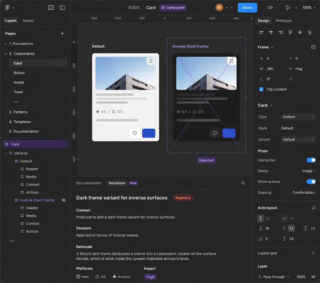
Rejected in favour of inverse tokens. This is the one that would have shipped quietly, because a dark variant looks like thoroughness and works perfectly well, right up until a brand whose inverse surface is not black. A hardcoded theme stays invisible until the system has to retheme, and then it is everywhere at once.
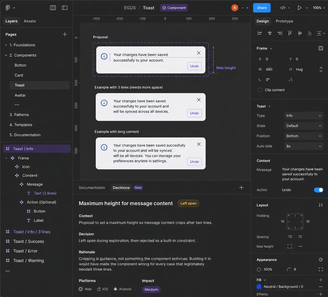
Left open, then rejected. It did not resolve on the first pass. A two-line cap is right most of the time, which is what makes it tempting to enforce. The examples beside it are the argument. Guidance can be broken when the content needs it. A constraint cannot.
One component, three platforms and Figma, each honouring its own conventions rather than one design relabelled three times.
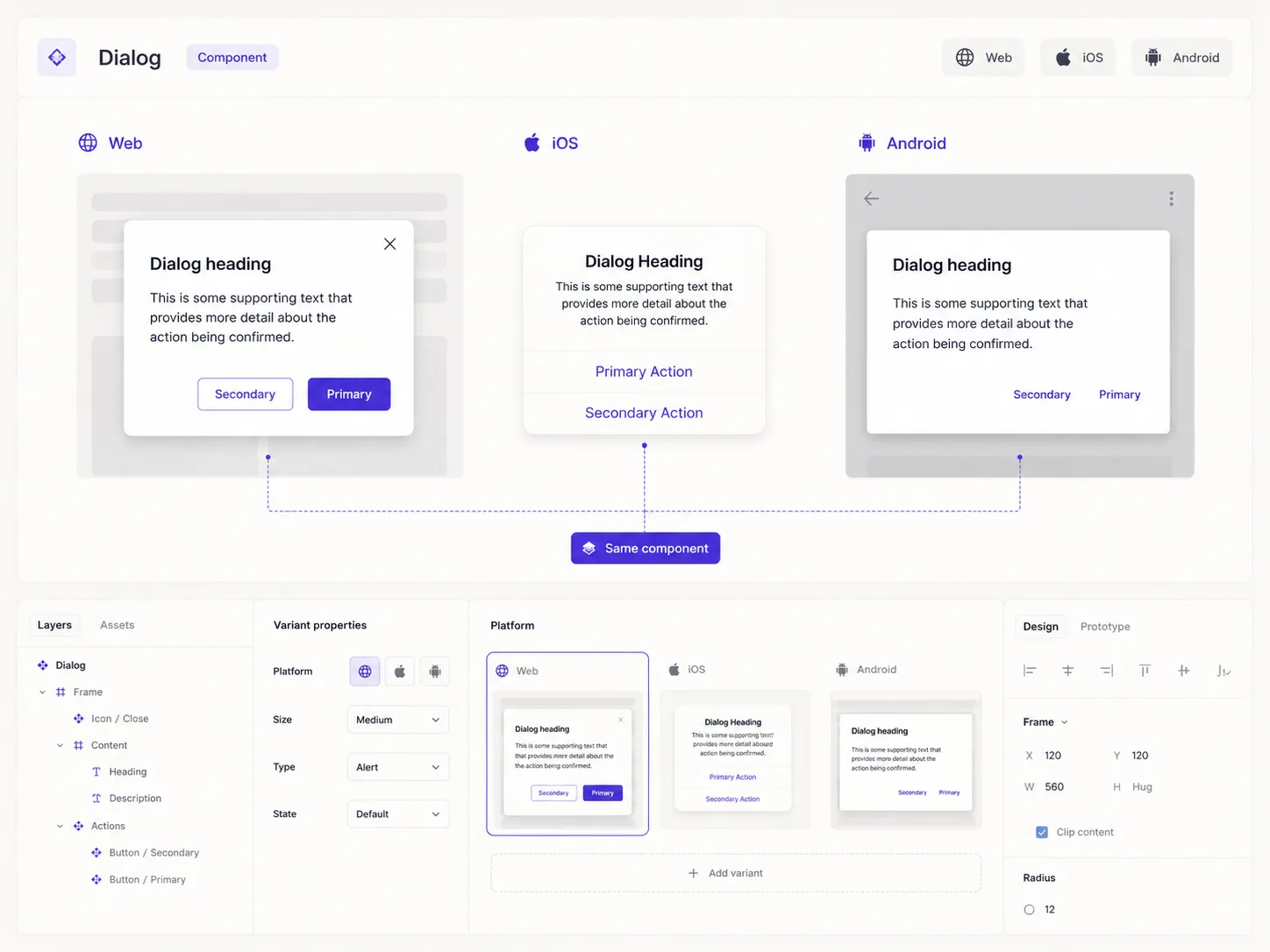
Dialog shows the shape. Platform is a variant axis on one component set, with its own actions nested inside: one to three actions, two emphases and two arrangements. What had been three teams’ opinions is a property of that one component.
The pod was made redundant before the architecture reached production, but the specification work outlived it, and the Figma library built on it launched in February 2026 and is now in use across the group.
Figma Library Analytics and Google Analytics, Expedia Group Design System. Forks since the EGDS 2.0 UI kit launched on 26 February 2026. Documentation views from 14 April to 17 July 2026, including 1,253 for the new library. The 67 are product teams using the library, leaving out the design system team, out of 117.
These figures count take-up: the library, and the prototype kit built on it. They do not say whether the system made anything better. The largest single source of insertions is the design system team itself, which is what five months after a launch looks like.
A UX researcher built the loyalty screens herself out of the new components, and said it was amazingly easy. She is not a designer on the system. Loyalty then shows up on its own in the insertion data, so the remark and the numbers describe the same thing.
Two things were still moving when this data was taken. Coded components were being built against the same specifications, and the prototype kit was to be rebuilt on production code, where it had been on Figma components.
Next
Product design
On iOS, 2.5 extra bookings for every 100, and an estimated $3.6 million a year.