Hotels.com Apps

The Hotels.com apps, on iPhone and Android, including a Google Play Editors’ Choice.

Product design · iOS and Android · 2016, refreshed 2019

The home and the results

The home screen, the results page, and the tests on them are written up as the case study. This page is the rest of the apps.

The measured work is the case study.

Past the home screen

Three phones, left to right. The list can use business-trip filters, and a quick book for a hotel you have already stayed in. A sponsored stay sits in that list, in the same kind of card. The middle phone is the trip: who you are travelling with, and a price that has moved. The right phone is the guide to the city: the hotel, the essentials, and getting around.
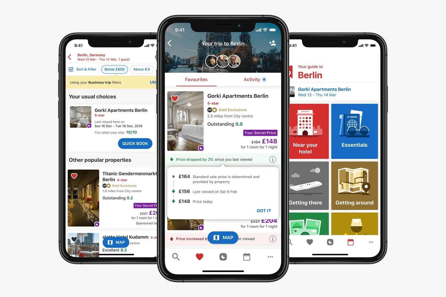
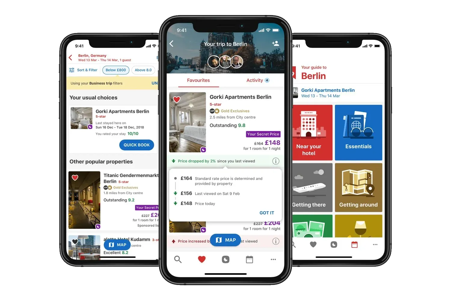
Three iPhones. A results list with business-trip filters, a trip to Berlin with a price change, and a Berlin guide with tiles for the hotel, essentials, and getting around.Three iPhones. A results list with business-trip filters, a trip to Berlin with a price change, and a Berlin guide with tiles for the hotel, essentials, and getting around.

A lighter app

A lighter app, in 2019, was for markets with a slow connection. Fewer calls to the server, and Apple Pay in one tap. The iOS team showed an early build of the path.
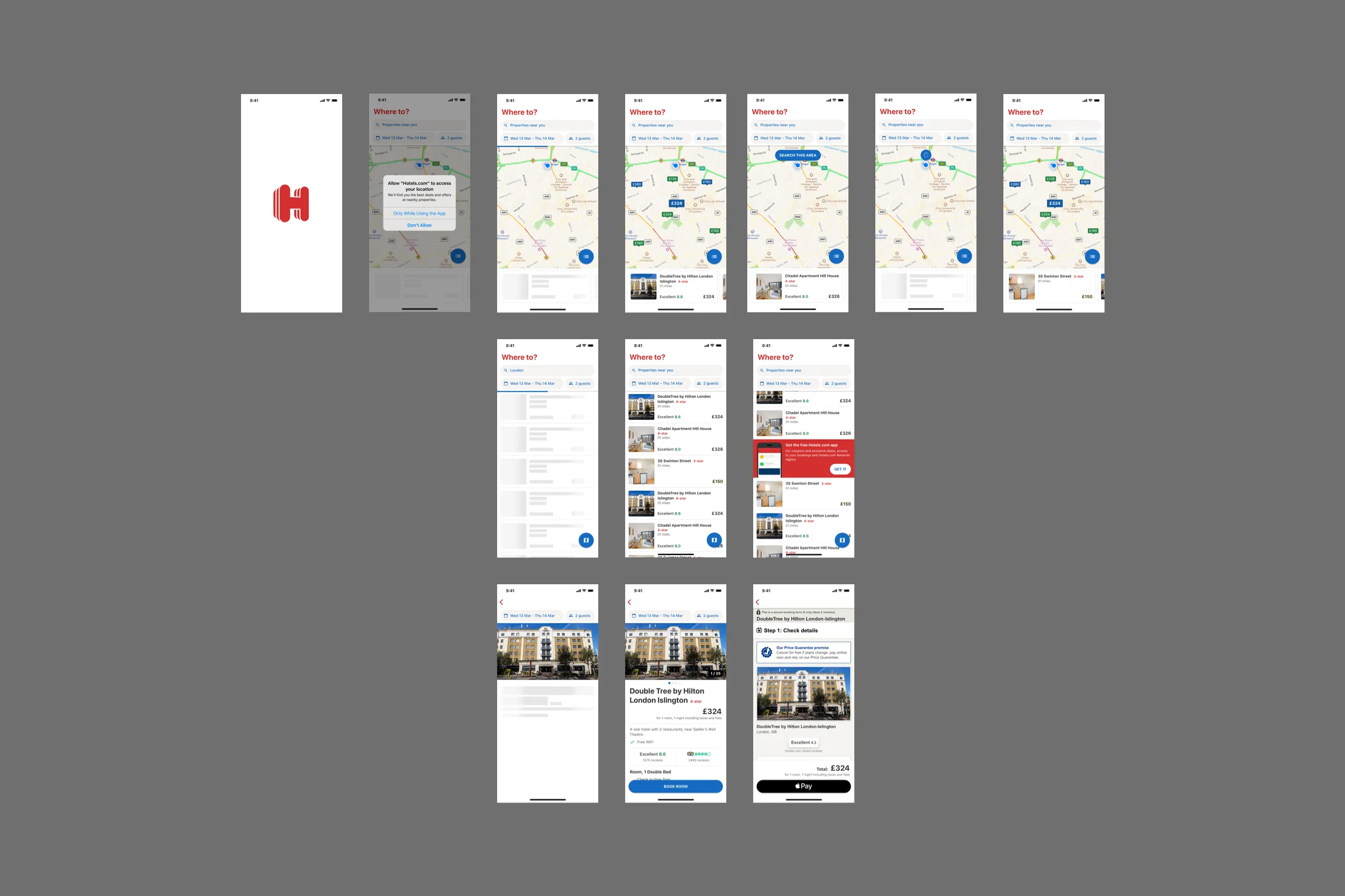
Hotels.com on iPhone, from the red H through a map, a list of stays, a hotel page for the DoubleTree by Hilton London, and Apple Pay.
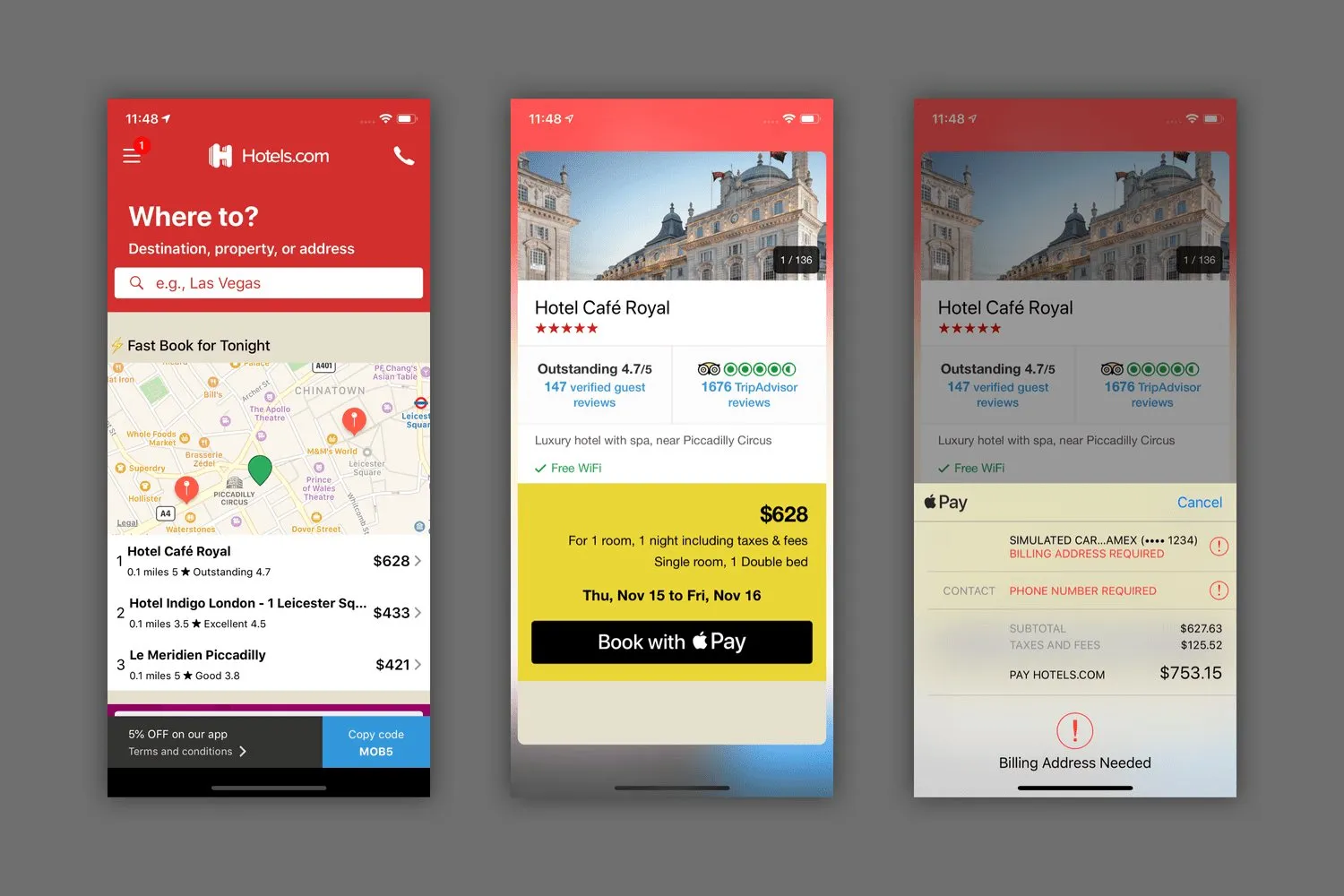
The path: a map of tonight’s hotels, the list, the hotel, then Apple Pay.
An early iOS build of the lighter app. A map of tonight’s hotels, Hotel Café Royal at $628 with Book with Apple Pay, and the Apple Pay sheet asking for a billing address.
The early build, with Apple Pay open.

Light and dark

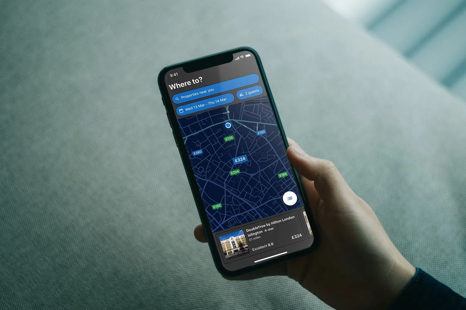
The same map and the same list were drawn for a dark mode, ready for iOS 13 and Android Q. Light first, then dark.
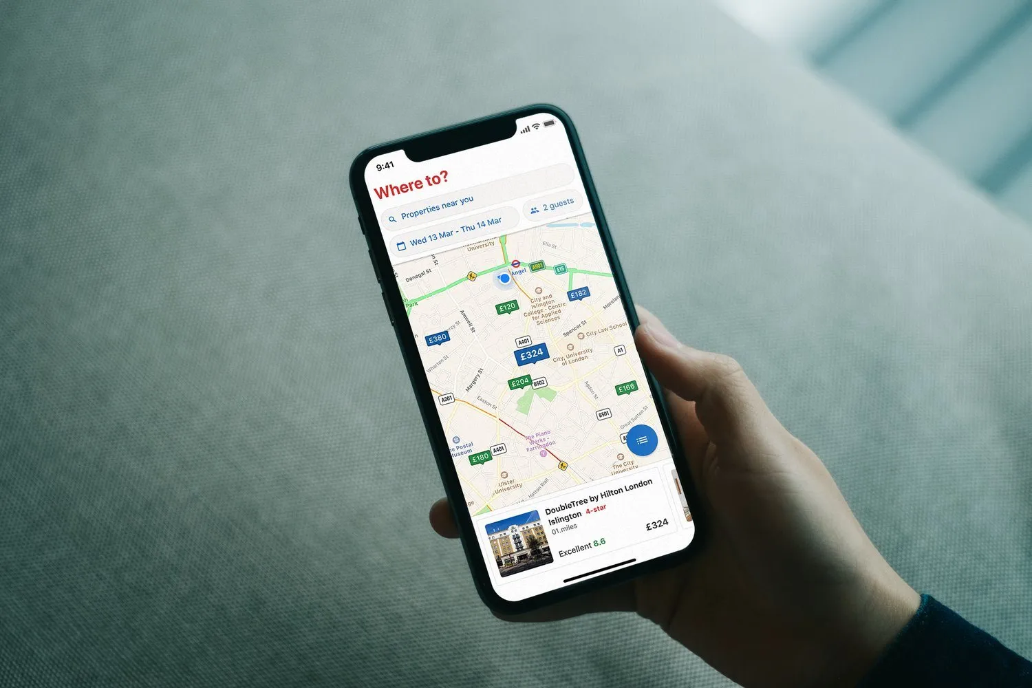
A hand holds a phone over grey fabric. The Hotels.com map is light, with price pins, and a card for the DoubleTree by Hilton London Islington at £324.
The map.
The same map in the dark theme. The streets are navy, the prices are green, and the hotel card is dark.
The same map, in the dark theme.
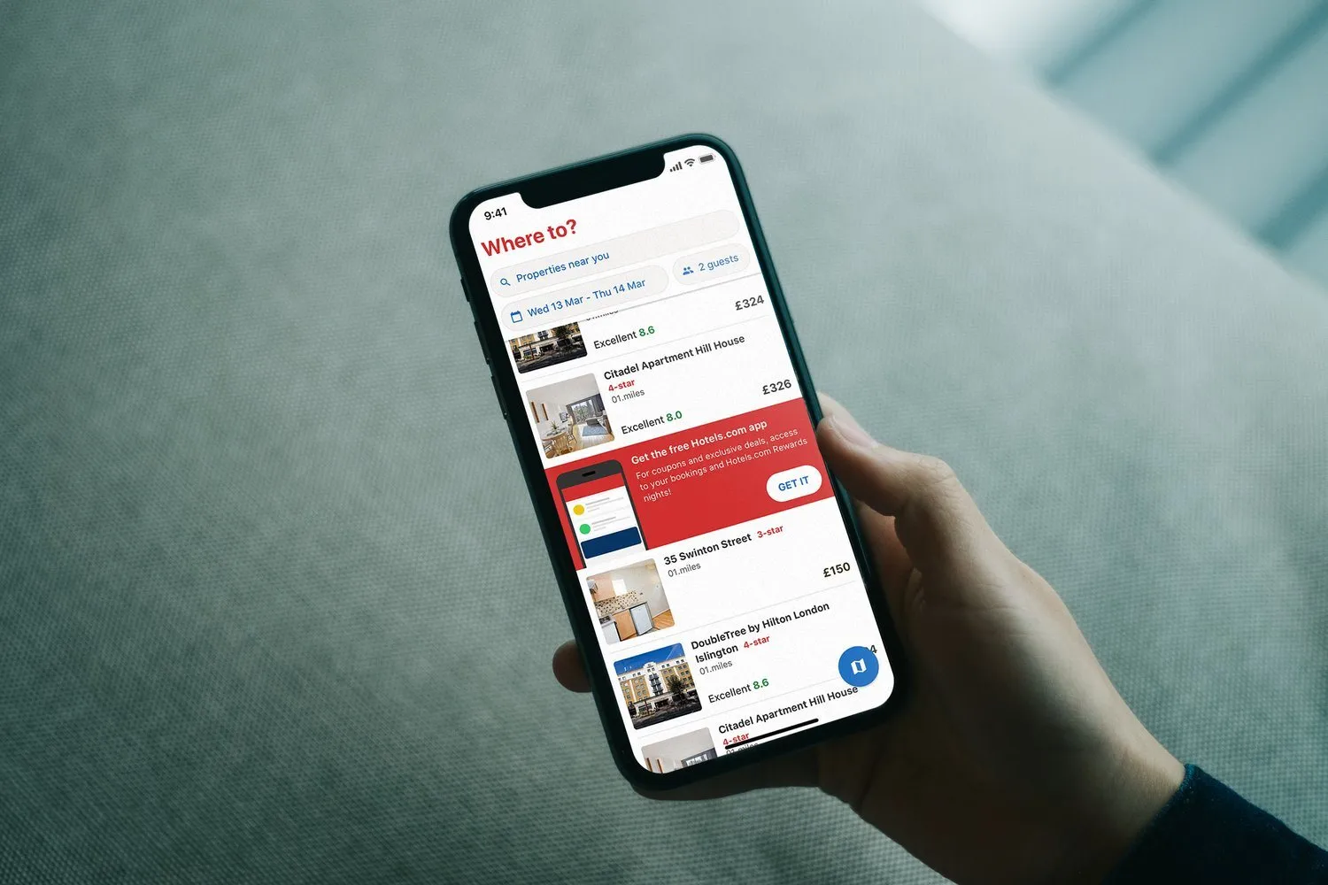
A hand holds a phone. The Hotels.com list is light, with Citadel Apartment Hill House, a red banner for the free app, and the DoubleTree by Hilton.
The list.
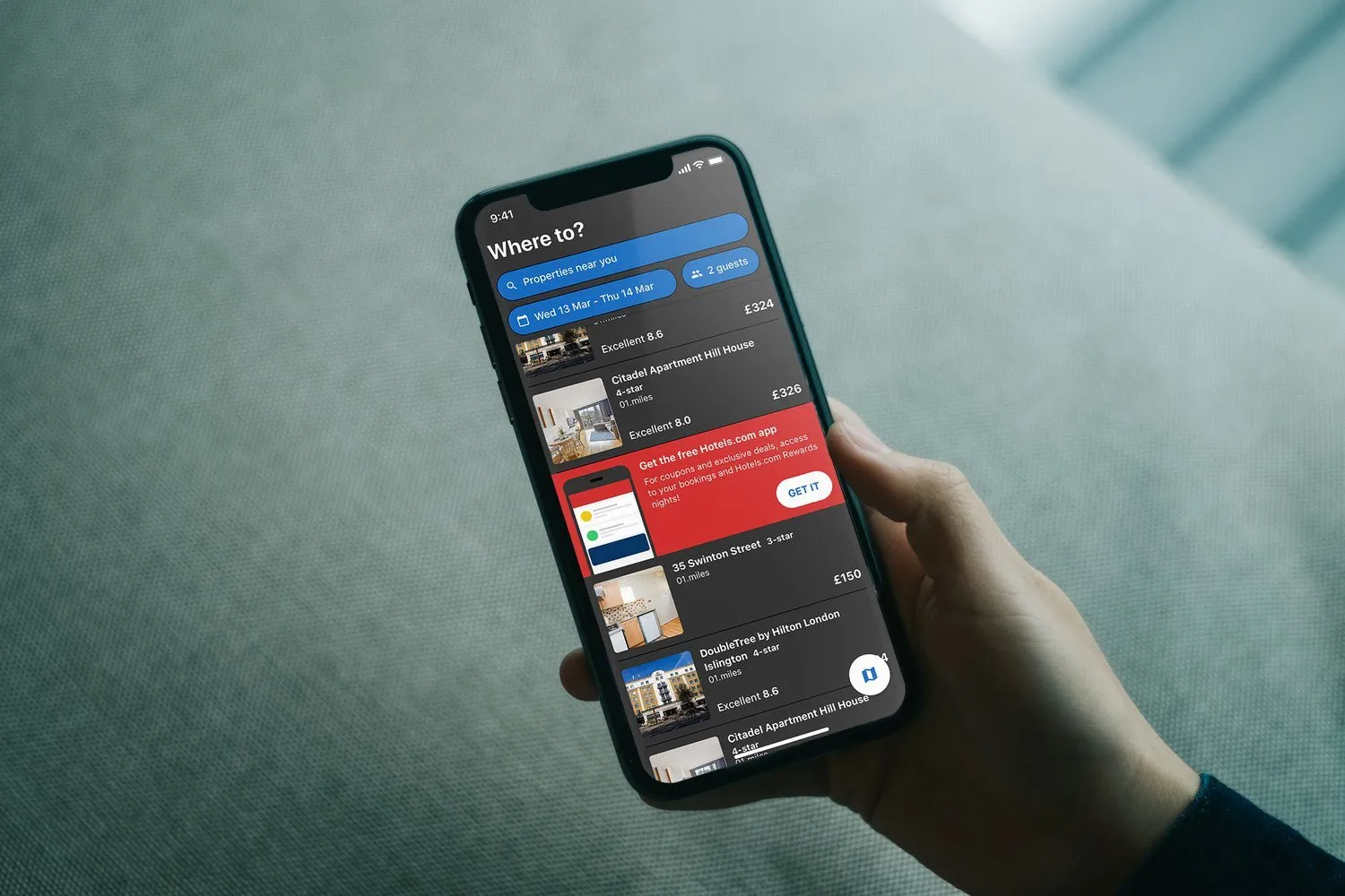
A hand holds a phone. The results list is dark, with a red banner for the free app, and hotels including Citadel Apartment Hill House and the DoubleTree by Hilton.
The same list, in the dark theme.

The store

The store screenshots were tested with Mobile Marketing, and with an outside agency, ASO CO. From April 2017 to April 2018, installs rose by 50%. Ratings sat above the usual mark for the category, and the app was featured on iOS in more than one region.
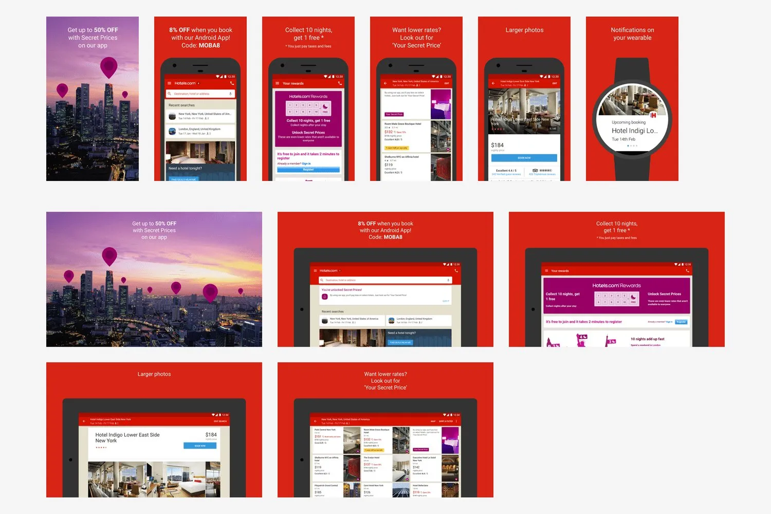
App Store screenshots on red. Secret Prices, a code for the Android app, rewards, larger photos, and a watch notification for Hotel Indigo.App Store screenshots on red. Secret Prices, a code for the Android app, rewards, larger photos, and a watch notification for Hotel Indigo.
Secret Prices, a code for the Android app, rewards, larger photos, and a watch notification.
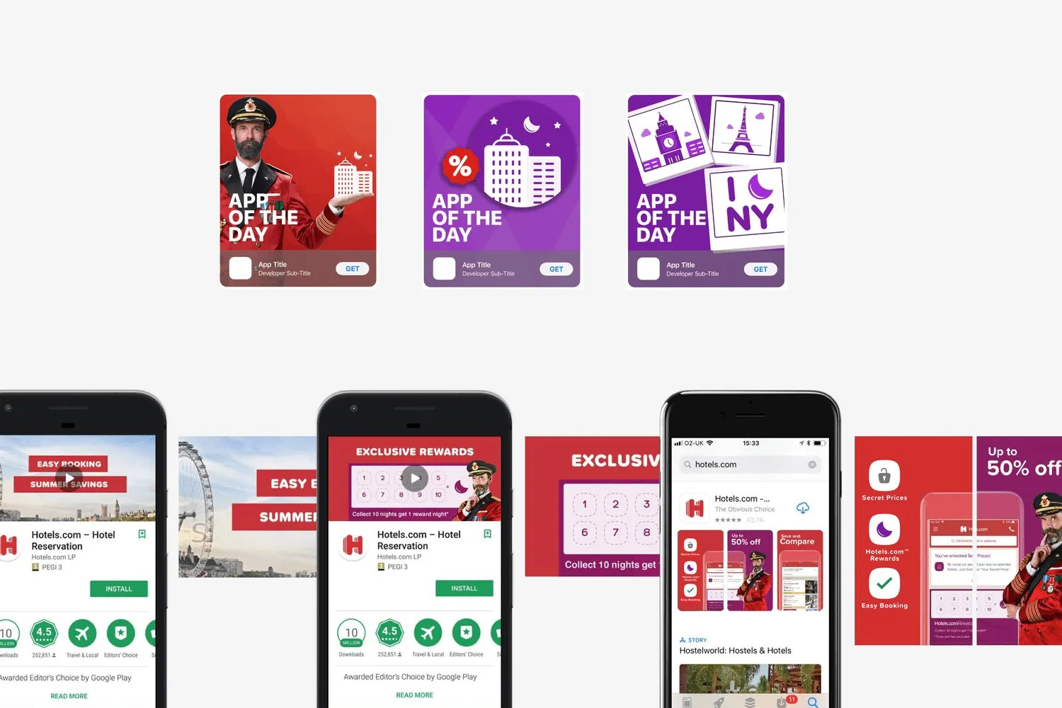
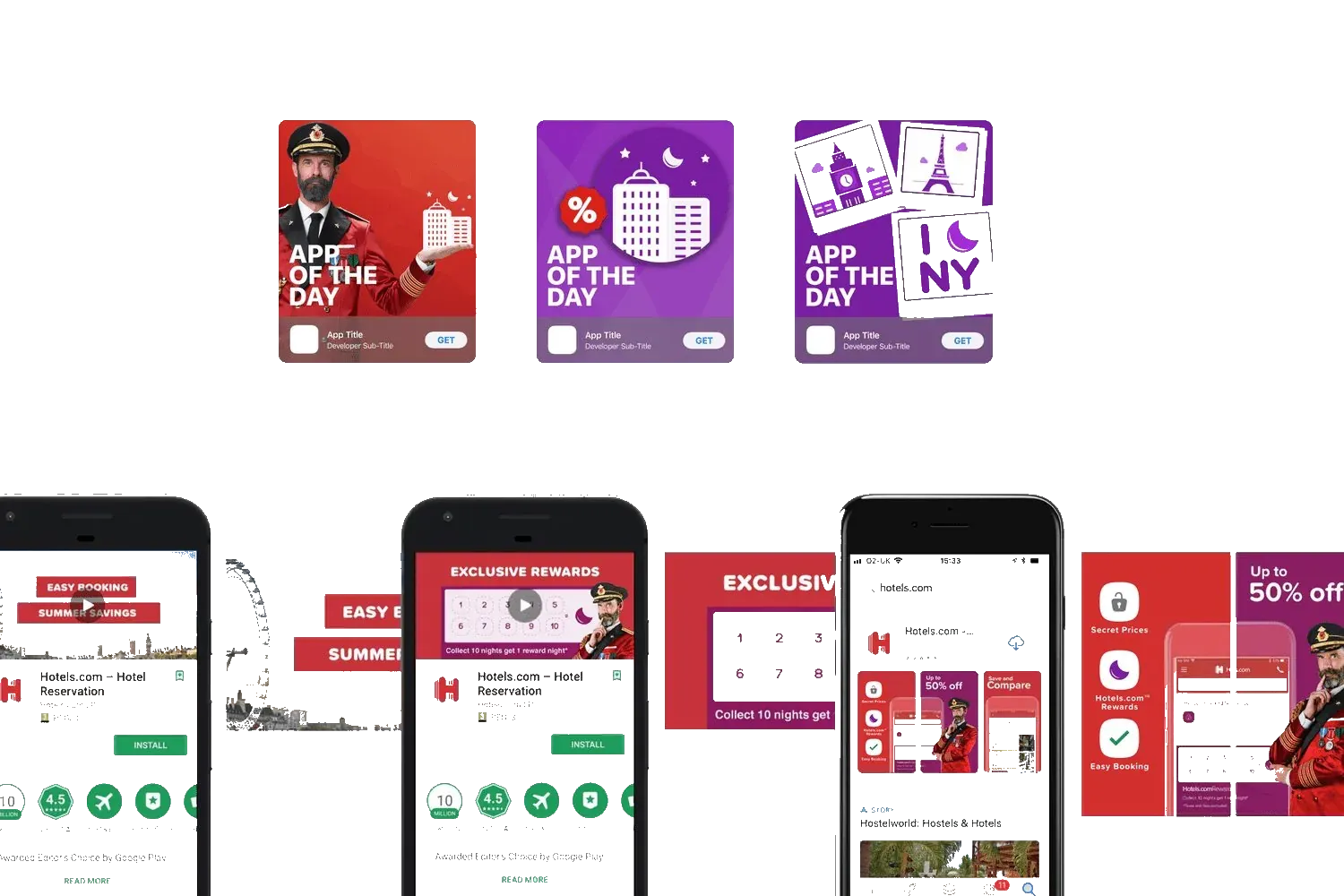
Store artwork for App of the Day, and the Google Play listing with an Editors’ Choice badge.Store artwork for App of the Day, and the Google Play listing with an Editors’ Choice badge.
App of the Day, and the Play listing with the Editors’ Choice badge.

Lining the apps up with the website

Two pieces of work sat beside the home screen, and both used KES, also called UHDS. That was Hotels.com’s first design system, and the one the website already used.

The business wanted one build for every platform, because app releases were slow. The engineers and I disagreed with putting web pages inside the apps. Those pages lost accessibility and sharing, and they loaded onto a blank screen. I proposed a fix after each build. The result stayed unclear, and product went ahead.

I also chose to line the apps up with KES, so the site and the apps matched. I pitched that to the heads of design, mobile and product. It was approved, and the build had started. Both pieces stopped when the business moved every brand onto one platform. I then joined the Expedia Group Design System team.

Next